
apex-theme-android
/apex-theme-android
Przerabia wygląd aplikacji Oracle APEX na motyw Setproduct Android UI kit: indygo i bursztyn, karty z cieniem, na natywnych komponentach i pliku CSS.
- Autor
- kwanganton ↗
- Repozytorium
- apex-setproduct-themes ↗
- Licencja
- MIT
- Ostatnia zmiana repozytorium
- 31.10.2026
Ocena i bezpieczeństwo
- Pliki w paczce
- 2
- Skrypty
- 0
- Komentarze HTML
- 0
- Adresy URL w SKILL.md
- 3
Brak sygnałów. Repozytorium zmienione 31.10.2026, bez odwołań do wycofanych modeli i API.
MIT, otwarta: można używać i zmieniać, z zachowaniem informacji o autorze.
Co robi i kiedy
Przerabia wygląd aplikacji Oracle APEX na motyw Setproduct Android UI kit: indygo i bursztyn, karty z cieniem, na natywnych komponentach i pliku CSS.
Oryginalny opis (EN)
Restyle an Oracle APEX app to look like the Setproduct Android UI kit (Android app templates: indigo-blue, amber accents, Roboto, elevation cards) using native Universal Theme components plus a drop-in CSS file. Use when the user asks for the Android UI kit theme/look/style in APEX, or picks it from the apex-setproduct-themes catalog.
Jak działa
- Preview
- The look
- Files
- Key tokens (light)
- Build it with native components
- Charts
- Dark / light
- Verify
Podgląd SKILL.md
---
name: apex-theme-android
description: "Restyle an Oracle APEX app to look like the Setproduct Android UI kit (Android app templates: indigo-blue, amber accents, Roboto, elevation cards) using native Universal Theme components plus a drop-in CSS file. Use when the user asks for the Android UI kit theme/look/style in APEX, or picks it from the apex-setproduct-themes catalog."
---
# Setproduct Android UI kit -> Oracle APEX
**Category:** Mobile | **Kit:** https://www.setproduct.com/templates/android-ui-kit | **Modes:** light (default light)
Read `../apex-setproduct-themes/SKILL.md` first for the shared method (native-first rules, install steps,
component map). This file only holds what is specific to Android UI kit.
## Preview
**Light**
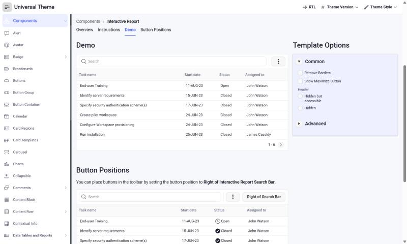
*Oracle's Universal Theme reference app (APEX 26.2, Interactive Report page), stock markup + this theme's CSS only.*
## The look
- Indigo-blue primary, amber/orange accents, Roboto type.
- Elevated photo cards, filters, maps, planners, wishlists - 140 templates.
**Fonts:** body `Roboto`, headings `Roboto` (loaded from Google Fonts by the CSS `@import`;
self-host them as Static Application Files if the app's CSP blocks fonts.googleapis.com).
## Files
- `theme-light.css` - light mode; create the Theme Style from **Vita** (default)
Each file is self-contained (font import + `--sp-*` tokens + base bridge + Android UI kit signature rules).
## Key tokens (light)
| Token | Value |
|---|---|
| `--sp-primary` | `#546CFC` |
| `--sp-accent` | `#FC9C04` |
| `--sp-success` | `#2EB872` |
| `--sp-warning` | `#FC9C04` |
| `--sp-danger` | `#F0445A` |
| `--sp-info` | `#2C7CEC` |
| `--sp-bg` | `#F7F8FC` |
| `--sp-surface` | `#FFFFFF` |
| `--sp-border` | `#E3E6EF` |
| `--sp-text` | `#1A1D29` |
| `--sp-text-muted` | `#6B7083` |
| `--sp-nav-bg` | `#FFFFFF` |
| `--sp-nav-active-bg` | `#ECEFFF` |
| `--sp-radius-md` | `8px` |
| `--sp-radius-lg` | `12px` |
| `--sp-btn-radius` | `8px` |
To re-tint, change tokens in `src/themes.py` and run `python build.py` - or override just the `--sp-*`
variables in Theme Roller's **Custom CSS** box, which loads after the file.
## Build it with native components
| Kit element | Native APEX implementation |
|---|---|
| Photo cards | Cards region, Media Source = Image, Layout = Grid |
| Filters | Faceted Search region |
| Maps | Map region (native) |
Everything else follows the shared component map (`../apex-setproduct-themes/references/component-map.md`).
**Signature utility classes** (put in a region's or item's *Appearance > CSS Classes*): none - the base layer covers this kit
## Charts
Paste into each Chart region's **Attributes > Advanced > Initialization JavaScript Function**:
```javascript
function( options ) {
options.styleDefaults = options.styleDefaults || {};
options.styleDefaults.colors = [ "#546CFC", "#FC9C04", "#2C7CEC", "#74B4DC", "#2EB872", "#F0445A", "#A4CCFC", "#FCECC4" ];
return options;
}
```
## Dark / light
This kit is light-only; no second style is needed.
## Verify
1. Run a page with a Side Menu, a Cards region, an Interactive Report, a form with Floating labels and a Hot button.
2. Check the side menu's current item, focus rings (Tab key), Hot button contrast, and the IR header in both modes.
3. Check the Login page (page template *Login*) and a Modal Dialog.
4. Compare side by side with the kit preview at https://www.setproduct.com/templates/android-ui-kit and nudge tokens, not selectors.
Pliki w paczce (2)
- SKILL.md 4 KB
- theme-light.css 14 KB
Wersje
W bazie nie ma innych skilli o nazwie apex-theme-android.
Migawka bazy z 13.11.2026 · wersja paczki bd501eb4ca70 (skrót SHA-256 całej paczki)
Pobrania w ostatnich 30 dniach: 0 · ranking
Zgłoś problem z tym skillem: szkodliwa treść, błędny opis albo prośba autora o usunięcie.
Podobne skille
- 100apex-theme-material
Przerabia wygląd aplikacji Oracle APEX na motyw Setproduct Material Design System: Roboto, cienie i zaokrąglenia 4 px, na natywnych komponentach i pliku CSS. - 100apex-theme-mobile-x
Przerabia wygląd aplikacji Oracle APEX na motyw Setproduct Mobile X: czysty niebieski, limonkowy akcent i ciemne warianty, na natywnych komponentach i pliku CSS. - 95oracle-apex-specialist
Wspiera tworzenie aplikacji Oracle APEX, w tym budowanie stron, REST, uwierzytelnianie, wykresy, wtyczki i wdrażanie. - 90apex-ux
Dba o czytelność ekranów Oracle APEX: nagłówki, kolumny, filtry, pola edytowalne, puste stany i wyświetlanie nazw zamiast identyfikatorów. - 91app-look
Zmienia wygląd aplikacji: kolory, czcionki, odstępy, rozmiary i ukrywanie lub restylizację części okna, przez edycję pliku theme.css. - 100create-ui-theme
Tworzy nowy motyw interfejsu w formie gotowego skilla, z tokenami CSS, galerią i instalatorem, na przykład Material 3.